
One design across several products, or different designs for each?
When a merch line reuses one artwork: what survives the format change, what has to be adapted, and how to choose between reuse, tuned variants and per-format redesigns — before the quantity split.
OFFPRESS editorial · Researched against external sources · Stage: First order · 2 Sept 2026
The instinct is to take the one illustration you’re proud of and put it on everything. It saves your time, it looks coherent, and it’s how a lot of first merch lines start. It also produces the classic result: the keychain is great, and the badge is an unreadable smudge of the same idea.
The short answer: reuse the design concept, not the file. Formats change what a design can show — size, transparency, cut shape, print surface — so most “one design” lines are really one concept plus a tuned file per format. Decide that before you split quantities, because the split itself depends on it.
The artwork anatomy — what stays and what changes
Think of a design as layers with different jobs. Across formats, some layers survive and some have to be redone:
| Layer | What it does | Across formats |
|---|---|---|
| Mark / core shape | The silhouette people recognise | Keep identical — this is the recognisability |
| Colour palette | The line’s identity | Keep as a system: same palette, rebalanced for the surface |
| Type / lettering | The words | Keep the typeface; re-fit the text to each format’s size floor |
| Scene / detail | The illustration content | Per format — may need cropping, simplifying or dropping |
| Effects | Holographic, glitter, epoxy, satin | Format by format; effects are surfaces, not artwork |
The rule: keep the layers that make it yours, re-fit the layers that the format physically decides. A badge that carries the same mark and palette but a simplified drawing is still “one design.” A badge that carries an uncropped sticker file is neither.
What each format changes, in one table
| Format | Size & aspect | Background & transparency | Cut / shape | Risk to the artwork |
|---|---|---|---|---|
| Acrylic keychain | Small square-ish, ~25–75 mm | Clear base = white underbase logic; effect bases change colour | The cut-out is part of the design | Text and fine detail hit the size floor first |
| Sticker | Widest range; portrait or landscape freely | Printed on your choice of vinyl; clear is an option | Any outline — die-cut or kiss-cut sheet | Effect finishes bury small text; laminate glare |
| Fridge magnet | Mid-size, usually rectangular | Opaque print face; the back is magnetic | Shape is typically simple | Flexible magnet surface can look soft under print |
| Badge | The smallest canvas | Printed paper insert under clear film — opaque | Round or presets | Detail is lost first; the picture becomes a symbol |
| Sticky note | Fixed print zones | Opaque paper | The pad construction, not you | The area is preset — layout, not art |
The adaptation ladder
1. Reuse as-is. Only works when the format genuinely shows the same thing — typically one big bold mark moving between sticker and magnet, or between sticker and a clear keychain at a good size. If anything shrinks below its readable floor, this stops being free.
2. Tune. Same artwork, adapted file: crop to the new aspect, rebalance the palette for the new surface (dark backgrounds on light bases, colours that survive an underbase), drop effects that fight the finish, re-fit type to the size floor. This is the normal cost of a coherent line — budget the time for it, because it’s the difference between “line” and “one design, several ruins.”
3. Redraw for the format. When the format is a different medium (a simplified badge mark, a small keychain icon), keep the mark and palette, and draw a simplified version. This is what brands do — the badge is a symbol, not a thumbnail of the sticker.
Where people get hurt is jumping from 1 to 3: tuning (2) fixes most cases, and redrawing (3) is for genuinely different media, not for laziness of layout.
The same ladder repeats within one format when the surface differs per unit — phone models are the clearest case: the camera cutout and proportions move the safe area under one design. See one artwork, many phone models.
The line-coherence test
Before you order, ask: if these products sat together on a table, would a stranger see one line or five orphan products? If they’d see five orphans, the problem is usually abandoned layers — palette or type drifted between files — not the artwork itself. Fix the layers first, redraw second.
The mismatch has a cost beyond aesthetics: the more differently each format performs, the more you need separate artwork per format, and the more your quantities need to follow the design split — which is exactly the question that planning quantities across designs solves. If you’re still choosing which formats the line should be in at all, that decision comes first: which format fits your artwork.
Order the line, not the artwork: tell us the design count and the format list, and the quote comes back with per-format artwork questions attached — the same split that decides the production run.
Researched and written by the OFFPRESS editorial desk. General production principles are kept separate from order-specific figures — anything that depends on your job (lead time, sample cost, freight) is marked as confirmed with your quote, not stated as a blanket promise.
RELATED PRODUCTS
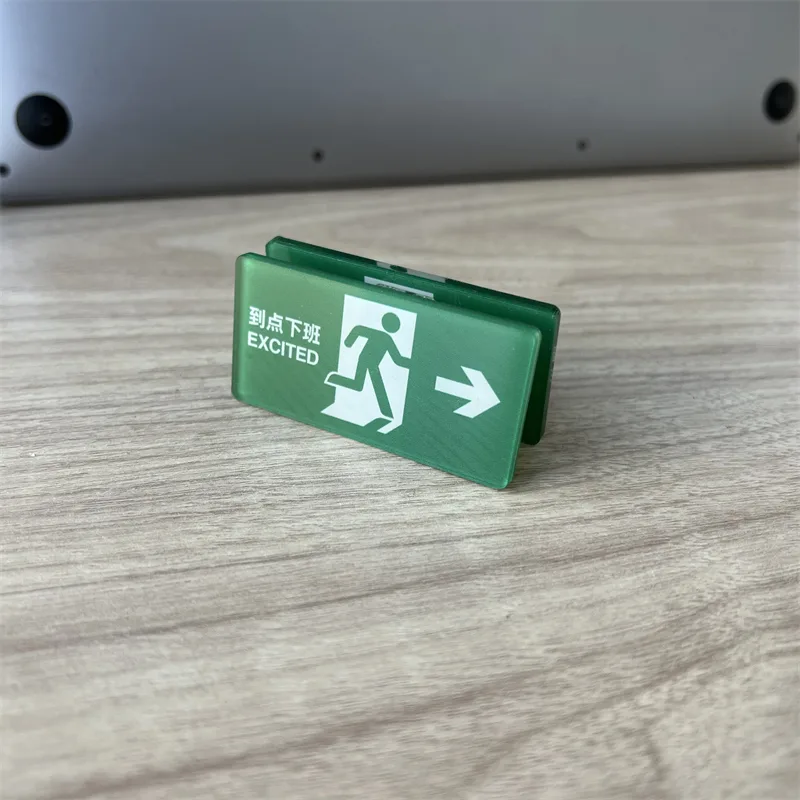
Acrylic Keychains
Cast acrylic, UV printed, cut to your outline. Epoxy, holographic or flat — your call.
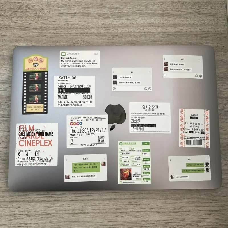
Stickers
Die-cut to your outline or kiss-cut on a sheet. Gloss, matte, holographic or clear.
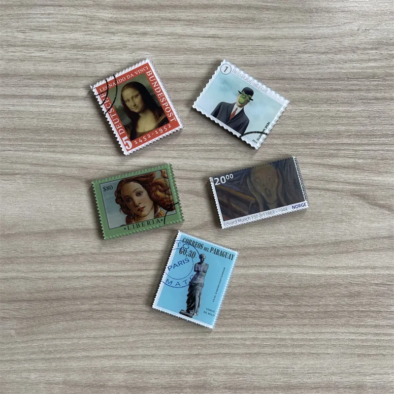
Fridge Magnets
The same artwork, a different object on the shelf. Printed, domed and backed to hold what you need it to hold.
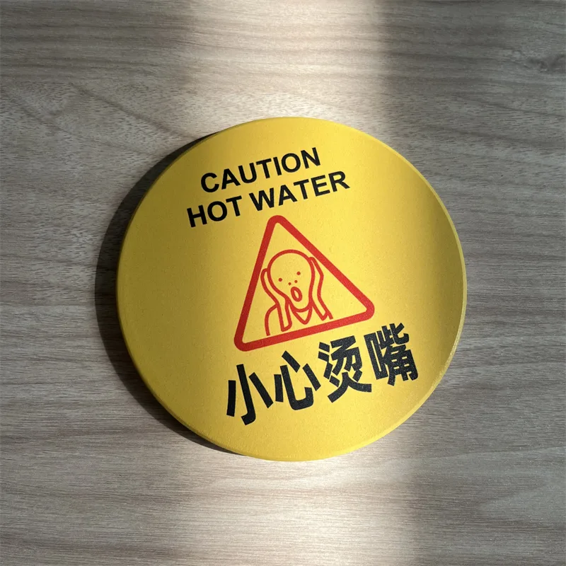
Badges & Pins
Pin-back badges pressed to size. Loud artwork, low unit cost, easy to add to any order.
KEEP READING