
White ink and printing on clear acrylic: why transparent bases need a hidden layer
Why colours printed directly on clear acrylic look washed out, what a white ink underbase does, and when leaving the base transparent is the better design decision.
OFFPRESS editorial · Researched against external sources · Stage: Preparing artwork · 2 Sept 2026
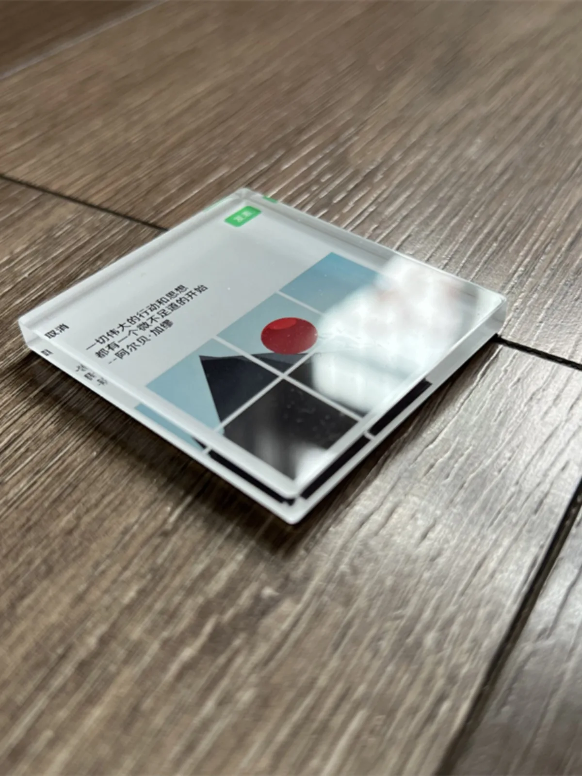
Print a full-colour design directly onto clear acrylic and something quietly disappointing happens: the colours go translucent and washed out. The artwork isn’t wrong and the printer isn’t broken — the substrate is just doing what clear things do, letting light pass through instead of bouncing it back to your eye.
The physics in one paragraph
CMYK inks are translucent. On white paper they look right because light passes through the ink, hits the white base, and reflects back through the colour. On a clear sheet there’s no white base — light travels through the ink, through the acrylic, and off whatever is behind it (your desk, your pocket, the air). The colour loses its anchor: mid-tones go murky, pale colours nearly vanish, and dark designs on clear become hard to read. This holds across UV printing on transparent substrates generally, not just acrylic — the same logic applies to clear vinyl.
What the white underbase does
The fix is a layer of white ink printed under the colour layer — artificial white paper, exactly where the design needs it. Light hits the colour, passes through, reflects off the white layer, and comes back through the ink the way the design expects. Saturation and readability snap back.
The white layer is a design decision, layer by layer:
- White under everything — full opacity; the design reads the same against any surface. Standard for keychains and magnets that need to “pop”.
- White under part of the design — artwork elements that need solidity get the base; the rest stays see-through.
- No white at all — the clear base becomes part of the look. Right for designs meant to read as glassy and subtle (outline-style art, ghosted text). Wrong for anything that needs contrast from a distance.
One nuance from the printing side: white ink is itself slightly translucent, so full opacity on clear or dark bases sometimes needs more than one white pass — which is why “white ink” is a spec-sheet line, not an on/off switch, and why two vendors’ “white ink” results can differ.
How this shows up on real pieces
A lot of the charm merch you’ve seen mixes both approaches in one piece: a character or text block on a white base, floating inside a clear cut-line shape so the outline of the product stays transparent. Look at the clear pieces in our keychain gallery — the crisp, saturated elements are sitting on underbase; the empty areas around them are the bare acrylic.
What to decide before you send artwork
- Which parts of the design need to be opaque? Text and brand marks almost always; backgrounds occasionally.
- What will the piece be seen against? A charm sold on a card can afford more transparency than a magnet expected to read across a room.
- Tell your supplier the intent, not just the file. “Keep the outline clear, white under the character” gets you a different (and better) piece than “white everywhere” by default.
White underlay is part of how we quote acrylic pieces — where the design needs it, confirmed on your spec sheet rather than guessed. If your design lives somewhere between opaque and clear, send it over and say which parts should stay transparent; that one sentence saves a sample round.
Researched and written by the OFFPRESS editorial desk. General production principles are kept separate from order-specific figures — anything that depends on your job (lead time, sample cost, freight) is marked as confirmed with your quote, not stated as a blanket promise.
RELATED PRODUCTS
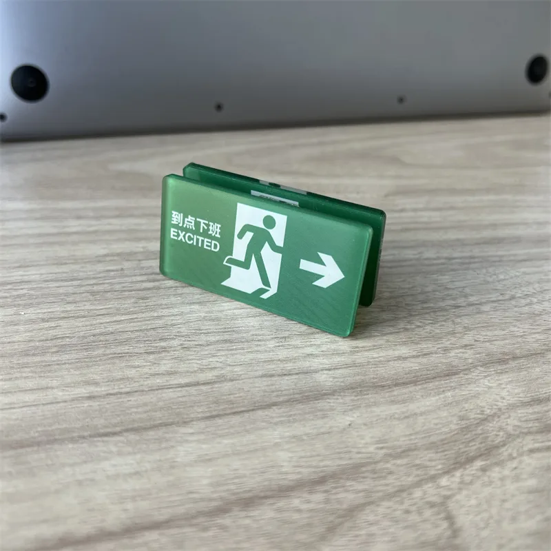
Acrylic Keychains
Cast acrylic, UV printed, cut to your outline. Epoxy, holographic or flat — your call.
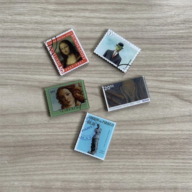
Fridge Magnets
The same artwork, a different object on the shelf. Printed, domed and backed to hold what you need it to hold.
KEEP READING