
RGB vs CMYK: why your print won't match your screen — and what actually helps
The physics behind screen-to-print colour shift, which colours suffer most, and the only reliable way to settle colour before production: a physical sample.
OFFPRESS editorial · Researched against external sources · Stage: Preparing artwork · 2 Sept 2026
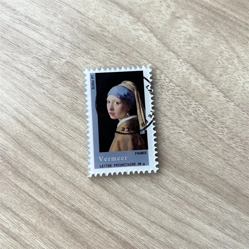
You send a file. The printed product comes back a little duller, a little different — sometimes a lot different. This isn’t carelessness; it’s two different colour systems meeting. Knowing which colours shift and why turns the disappointment into a manageable step in the process.
Two ways of making colour
Screens make colour by emitting light — red, green and blue sub-pixels mixed additively. That’s RGB. Print makes colour by absorbing light — cyan, magenta, yellow and black inks subtracting from white paper or substrate. That’s CMYK.
Because emitted light can be brighter than reflected ink, the RGB gamut is physically larger than CMYK. Some colours a screen can show cannot exist in ink — most famously:
- Neon and fluorescent shades (neon green, hot magenta, electric blue)
- Very saturated oranges and reds
- Deep, vivid blues — CMYK builds often land darker and duller than the screen showed
When conversion happens, out-of-gamut colours are simply clamped to the nearest printable colour. Nothing “went wrong” — the target colour moved to the closest thing ink can do.
Three honest mitigations
1. Design in CMYK (or soft-proof) from the start. If your tool offers it, working in a CMYK document shows you the print-restrained version of your palette while you can still change it. This is why many merch vendors, us included, ask for CMYK-preferred files and flag where RGB artwork will shift before printing.
2. Put the risky colours where they’re safe. Backgrounds and large fields show shifts most; accents and small elements less so. Neon that would disappoint as a background can charm as a highlight.
3. Settle it on a real reference. This is the only step that actually ends the colour conversation. Screens differ from each other too — most monitors are uncalibrated, so even the “right” file looks different on every screen it passes through. Ink on the real substrate is the ground truth, which is why proof-and-sample workflows exist across the printing industry, and why production should never start before the agreed reference is approved — physical where the job needs it, photographic where it doesn’t.
When a colour truly must match
For brand-critical colour there’s a stronger tool: spot colour — a pre-mixed ink (Pantone being the known system) applied directly instead of built from CMYK. Spot inks achieve far tighter accuracy on their covered range, and some Pantone colours are outside CMYK’s gamut entirely. Print shops quantify accuracy in ΔE — a measure of visible colour distance where roughly 1 is barely perceptible and 5+ is obviously different — with spot colours routinely tighter than CMYK builds.
Whether spot-colour ink is practical for your product and run size is a supplier question — on small-batch merch like charms and stickers, full-colour process printing is the norm, and honest suppliers will tell you where a spot-colour expectation doesn’t fit the process rather than promising it anyway. That’s a “confirmed with your quote” conversation, not a marketing-page promise.
The OFFPRESS-shaped summary
- Send CMYK-preferred files where possible; we flag RGB shifts before anything runs.
- Assume neon = disappointment at full-bleed scale; design accordingly.
- Colour gets settled on an agreed reference of your design before production — a physical sample where the job needs one; not on a screen, not on a stock photo.
That approval-before-production step is our answer to the RGB/CMYK gap, and it’s built into how every order runs. If your artwork lives in neon, say so when you send it — it changes what we propose.
Researched and written by the OFFPRESS editorial desk. General production principles are kept separate from order-specific figures — anything that depends on your job (lead time, sample cost, freight) is marked as confirmed with your quote, not stated as a blanket promise.
RELATED PRODUCTS
Acrylic Keychains
Cast acrylic, UV printed, cut to your outline. Epoxy, holographic or flat — your call.
Stickers
Die-cut to your outline or kiss-cut on a sheet. Gloss, matte, holographic or clear.
Fridge Magnets
The same artwork, a different object on the shelf. Printed, domed and backed to hold what you need it to hold.
Badges & Pins
Pin-back badges pressed to size. Loud artwork, low unit cost, easy to add to any order.
Sticky Notes
Repositionable pads with your artwork on the cover, the edge, or every single sheet.
KEEP READING